ComposeThemer#


This is a full compose theme engine that handles applying a theme as well as updating the system ui elements. Extendible and allows to simply apply user selected themes inside your app.
 Screenshots#
| Demo |
|---|
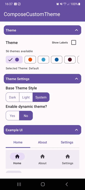 |
Features#
- allows to define custom user themes and applies them automatically
- ability to retrieve all registered themes
- supports system ui theming (status bar + navigation bar)
- build on top of
MaterialTheme - comes with optional 55 build-in themes
All features are splitted into separate modules, just include the modules you want to use!
 Dependencies#
| Dependency | Version | Infos |
|---|---|---|
| Compose BOM | 2024.04.00 | Mapping |
| Material3 | 1.2.1 |
Setup Gradle#
This library is distributed via JitPack.io.
2/2: Add dependencies to your module's build.gradle
Setup Library#
class App : Application() {

    override fun onCreate() {

        // register all available themes or register your custom themes
        ComposeTheme.register(
            *ComposeThemes
                .getAll()
                .toTypedArray()
        )
    }

}
 Usage#
// simply wrap your composable content inside ComposeTheme as if you would use MaterialTheme directly
val baseTheme = remember { mutableStateOf(ComposeTheme.BaseTheme.System) }
val dynamic = remember { mutableStateOf(false) }
val theme = remember { mutableStateOf("green") } // the key of an registered theme
val state = ComposeTheme.State(baseTheme, dynamic, theme)
ComposeTheme(state = state) {
    // content
}
 Demo#
Demo#
A full demo is included inside the demo module, it shows nearly every usage with working examples.
Modules and Extensions#
There only exists on very small extension for this library.
Extension Themes
This extension adds a collection of default themes that you can use if needed.
Advanced Usage#
Custom Statusbar / Navigationbar Colors
The default themes do use functions that allow you to define some custom statusbar / navigation settings if desired. Supported colors are default, primary and surface (those colors derive their color from the theme itself) or custom for fully user defined colors.
// get all themes with custom statusbar / navigation bar
ComposeTheme.getRegisteredThemes(
    statusBarColor = ComposeTheme.SystemUIColor.Surface,
    navigationBarColor = ComposeTheme.SystemUIColor.Surface
)

// or get a single predefined theme with custom statusbar / navigation bar
val theme = ThemeAmberBlue.get(
    statusBarColor = ComposeTheme.SystemUIColor.Surface,
    navigationBarColor = ComposeTheme.SystemUIColor.Surface
)
Credits#
This library contains 54 predefined color schemes inside the themes module. Those are all directly copied from FlexColorScheme - a very useful homepage that allows you to create your own themes and also contains 54 predefined themes already. With the permission of Rydmike I just copied every single predefined theme from his homepage and added it to this library.