ComposeDialogs#


This library offers you an easily extendible compose framework for modal dialogs and allows to show them as a dialog or a bottom sheet.
 Screenshots#
| Info Dialog | | | | |||
 |  |  |  | |||
| Input Dialog | | | | |||
 |  | |||||
| Number Dialog | | | | |||
 |  |  | ||||
| Date Dialog | | | | |||
 |  |  | ||||
| Time Dialog | | | | |||
 |  | |||||
| Color Dialog | | | | |||
 |  |  |  | |||
| List Dialog | | | | |||
 |  |  |  | |||
 |  |  | ||||
| Progress Dialog | | | | |||
 |  | |||||
Features#
- with this ibrary you get a very simple way to show dialogs
- supports showing dialogs as dialogs or bottom sheets
- easily extendible - creating a new dialog is just a few lines of code
All features are splitted into separate modules, just include the modules you want to use!
 Dependencies#
Compose
| Dependency | Version | Infos |
|---|---|---|
| Compose BOM | 2024.04.00 | Mapping |
| Material3 | 1.2.1 |
Library
| Module | Dependency | Version |
|---|---|---|
core | - | |
dialog-info | - | |
dialog-input | - | |
dialog-number | - | |
dialog-list | - | |
dialog-progress | - | |
dialog-time | - | |
dialog-date | - | |
dialog-color | - | |
dialog-billing | KotBilling | 0.7 |
Setup Gradle#
This library is distributed via JitPack.io.
2/2: Add dependencies to your module's build.gradle
// use the latest version of the library
val composedialogs = "<LATEST-VERSION>"

// include necessary modules

// core module
implementation("com.github.MFlisar.ComposeDialogs:core:$composedialogs")

// dialog module
implementation("com.github.MFlisar.ComposeDialogs:dialog-info:$composedialogs")
implementation("com.github.MFlisar.ComposeDialogs:dialog-input:$composedialogs")
implementation("com.github.MFlisar.ComposeDialogs:dialog-number:$composedialogs")
implementation("com.github.MFlisar.ComposeDialogs:dialog-list:$composedialogs")
implementation("com.github.MFlisar.ComposeDialogs:dialog-progress:$composedialogs")
implementation("com.github.MFlisar.ComposeDialogs:dialog-time:$composedialogs")
implementation("com.github.MFlisar.ComposeDialogs:dialog-date:$composedialogs")
implementation("com.github.MFlisar.ComposeDialogs:dialog-color:$composedialogs")
implementation("com.github.MFlisar.ComposeDialogs:dialog-billing:$composedialogs")
 Usage#
// create and remember a state
val state = rememberDialogState()

// show a dialog if necessary
if (state.showing)
{
    DialogInfo(
        state = state,
        // Custom - Required
        info: String,
        // Custom - Optional
        infoLabel: String = "",
        // Base Dialog -  Optional - all options can be set up with custom attributes, following are just the default examples
        title: (@Composable () -> Unit)? = null,
        icon: (@Composable () -> Unit)? = null,
        style: DialogStyle = DialogDefaults.styleDialog(), // DialogDefaults.styleBottomSheet() => both have a few settings...
        buttons: DialogButtons = DialogDefaults.buttons(),
        options: Options = Options(),
        onEvent: (event: DialogEvent) -> Unit = {
            // optional event handler for all dialog events
        }
    )
}

// show the dialog inside a button press event or similar
Button(onClick = { state.show() }) {
    Text("Show Dialog")
}
Alternatively, if you want to use one dialog with many items (e.g. for list items) you can do following:
// create and remember a state with data (e.g. an Integer)
val state = rememberDialogState<Int>(data = null)

// show a dialog if necessary
if (state.showing)
{
    val data = state.requireData()
    DialogInfo(
        state = state,
        // Custom - Required
        info = "Data = $data"
    )
}

// a list that uses the dialog
val items = 1..100
LazyColumn {
    items.forEach {
        item(key = it) {
            Button(onClick = { state.show(it) }) {
                Text("Item $it")
            }
        }
    }
}
 Demo#
Demo#
A full demo is included inside the demo module, it shows nearly every usage with working examples.
Modules and Extensions#
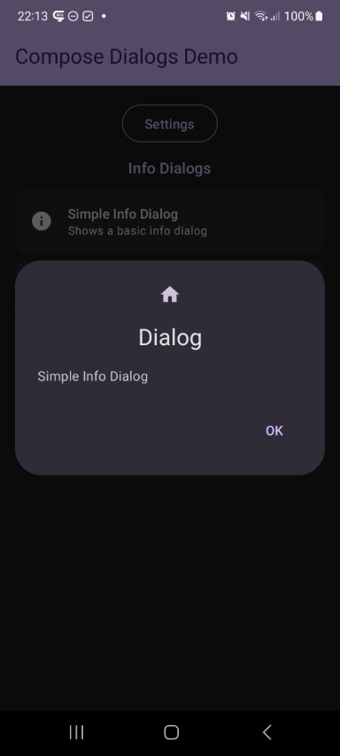
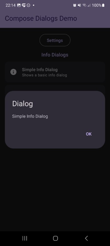
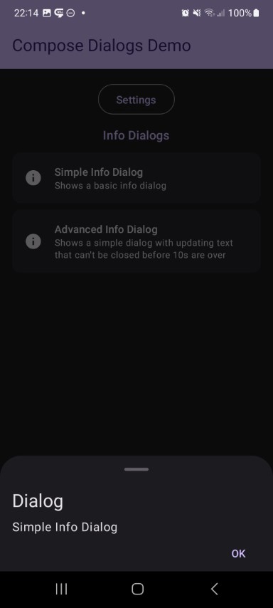
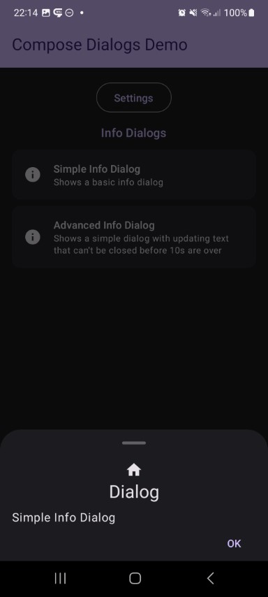
Info Dialog
| Preview | Module | |
|---|---|---|
| | info |
This shows a simple dialog with some informational text.
fun DialogInfo(
    state: DialogState,
    // Custom - Required
    info: String,
    // Custom - Optional
    infoLabel: String = "",
    // Base Dialog - Optional
    title: (@Composable () -> Unit)? = null,
    icon: (@Composable () -> Unit)? = null,
    style: DialogStyle = DialogDefaults.styleDialog(),
    buttons: DialogButtons = DialogDefaults.buttons(),
    options: Options = Options(),
    onEvent: (event: DialogEvent) -> Unit = {}
) {
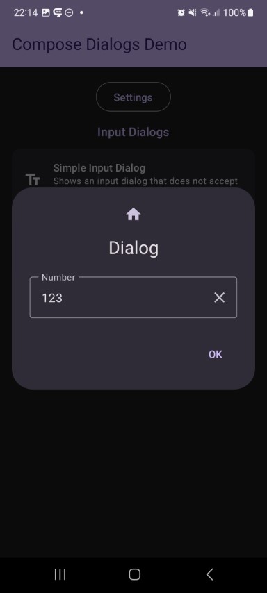
Input Dialog
| Preview | Module | |
|---|---|---|
| | input |
This shows a dialog with a InputField. All its parameters are exposed via the compose function as you can see below, which allows you to simply adjust the InputFields behaviour. Additinally you can attach a validator which ensures, that the dialog will only return a valid input and can't be closed otherwise.
fun DialogInput(
    // Base Dialog - State
    state: DialogState,
    // Custom - Required
    input: MutableState<String>,
    inputLabel: String = "",
    // Custom - Optional
    inputPlaceholder: String = "",
    singleLine: Boolean = false,
    maxLines: Int = if (singleLine) 1 else Int.MAX_VALUE,
    minLines: Int = 1,
    keyboardOptions: KeyboardOptions = KeyboardOptions(keyboardType = KeyboardType.Text),
    enabled: Boolean = true,
    clearable: Boolean = true,
    prefix: String = "",
    suffix: String = "",
    textStyle: TextStyle = LocalTextStyle.current,
    validator: DialogInputValidator = rememberDialogInputValidator(),
    requestFocus: Boolean = false,
    selectionState: DialogInput.SelectionState = DialogInput.SelectionState.Default,
    onTextStateChanged: (valid: Boolean, text: String) -> Unit = { _, _ -> },
    // Base Dialog - Optional
    title: (@Composable () -> Unit)? = null,
    icon: (@Composable () -> Unit)? = null,
    style: DialogStyle = DialogDefaults.styleDialog(),
    buttons: DialogButtons = DialogDefaults.buttons(),
    options: Options = Options(),
    onEvent: (event: DialogEvent) -> Unit = {}
) {
Number Dialog
| Preview | Module | |
|---|---|---|
| | number |
This shows a number picker dialog. You can always use the Input Dialog for numbers as well and change its options to accept numbers only and even attach an validator. But this one is meant for picking numbers with the help of one or two increase and decrease buttons.
fun <T : Number> DialogNumberPicker(
    // Base Dialog - State
    state: DialogState,
    // Custom - Required
    value: MutableState<T>,
    setup: NumberPickerSetup<T>,
    iconDown: @Composable () -> Unit = {
        Icon(imageVector = Icons.Default.KeyboardArrowLeft, contentDescription = null)
    },
    iconUp: @Composable () -> Unit = {
        Icon(imageVector = Icons.Default.KeyboardArrowRight, contentDescription = null)
    },
    iconDown2: @Composable () -> Unit = {
        Icon(imageVector = Icons.Default.KeyboardDoubleArrowLeft, contentDescription = null)
    },
    iconUp2: @Composable () -> Unit = {
        Icon(imageVector = Icons.Default.KeyboardDoubleArrowRight, contentDescription = null)
    },
    formatter: (value: T) -> String = { it.toString() },
    // Custom - Optional
    textStyle: TextStyle = MaterialTheme.typography.bodyMedium,
    onValueStateChanged: (value: T) -> Unit = { },
    // Base Dialog - Optional
    title: (@Composable () -> Unit)? = null,
    icon: (@Composable () -> Unit)? = null,
    style: DialogStyle = DialogDefaults.styleDialog(),
    buttons: DialogButtons = DialogDefaults.buttons(),
    options: Options = Options(),
    onEvent: (event: DialogEvent) -> Unit = {}
) {
Date Dialog
| Preview | Module | |
|---|---|---|
| | date |
This shows a date selector dialog. First day of week, labels, and style can be adjusted to your needs.
fun DialogDate(
    state: DialogState,
    // Custom - Required
    date: MutableState<LocalDate>,
    // Custom - Optional
    dateRange: DialogDate.Range = DialogDateDefaults.dateRange(),
    setup: DialogDate.Setup = DialogDateDefaults.setup(),
    // Base Dialog - Optional
    title: (@Composable () -> Unit)? = null,
    icon: (@Composable () -> Unit)? = null,
    style: DialogStyle = DialogDefaults.styleDialog(),
    buttons: DialogButtons = DialogDefaults.buttons(),
    options: Options = Options(),
    onEvent: (event: DialogEvent) -> Unit = {}
) {
Time Dialog
| Preview | Module |
|---|---|
| time |
This shows a time selector dialog. 24h mode is optional.
fun DialogTime(
    state: DialogState,
    // Custom - Required
    time: MutableState<LocalTime>,
    // Custom - Optional
    setup: DialogTime.Setup = DialogTimeDefaults.setup(),
    // Base Dialog - Optional
    title: (@Composable () -> Unit)? = null,
    icon: (@Composable () -> Unit)? = null,
    style: DialogStyle = DialogDefaults.styleDialog(),
    buttons: DialogButtons = DialogDefaults.buttons(),
    options: Options = Options(),
    onEvent: (event: DialogEvent) -> Unit = {}
) {
Color Dialog
| Preview | Module | |
|---|---|---|
| | color |
This shows a color selector dialog. A table with predefined material colors as well as a customisation page will be shown. Alpha support can be enabled optionally.
fun DialogColor(
    // Base Dialog - State
    state: DialogState,
    // Custom - Required
    color: MutableState<Color>,
    // Custom - Optional
    texts: DialogColor.Texts = DialogColorDefaults.texts(),
    alphaSupported: Boolean = true,
    shape: Shape = MaterialTheme.shapes.small,
    gridSize: Int = if (LocalConfiguration.current.orientation == Configuration.ORIENTATION_LANDSCAPE) 6 else 4,
    labelStyle: DialogColor.LabelStyle = DialogColor.LabelStyle.Value,
    // Base Dialog - Optional
    title: (@Composable () -> Unit)? = null,
    icon: (@Composable () -> Unit)? = null,
    style: DialogStyle = DialogDefaults.styleDialog(),
    buttons: DialogButtons = DialogDefaults.buttons(),
    options: Options = Options(),
    onEvent: (event: DialogEvent) -> Unit = {}
) {
List Dialog
| Preview | Module | |
|---|---|---|
| | list |
| | list |
This shows a dialog with a list of items. Rendering, selection mode and more is adjustable.
Here you can create a dialog based on static list data like following:
fun <T> DialogList(
    state: DialogState,
    // Custom - Required
    items: List<T>,
    itemIdProvider: (item: T) -> Int,
    itemContents: DialogList.ItemContents<T>,
    selectionMode: DialogList.SelectionMode<T>,
    // Custom - Optional
    divider: Boolean = false,
    description: String = "",
    filter: DialogList.Filter<T>? = null,
    // Base Dialog - Optional
    title: (@Composable () -> Unit)? = null,
    icon: (@Composable () -> Unit)? = null,
    style: DialogStyle = DialogDefaults.styleDialog(),
    buttons: DialogButtons = DialogDefaults.buttons(),
    options: Options = Options(),
    onEvent: (event: DialogEvent) -> Unit = {}
) {
But you can also create list with an asynchronous loader function like following:
fun <T> DialogList(
    state: DialogState,
    // Custom - Required
    itemsLoader: suspend () -> List<T>,
    itemIdProvider: (item: T) -> Int,
    itemContents: DialogList.ItemContents<T>,
    selectionMode: DialogList.SelectionMode<T>,
    // Custom - Optional
    itemSaver: Saver<MutableState<List<T>>, out Any>? = null,
    loadingIndicator: @Composable () -> Unit = {
        Box(modifier = Modifier.fillMaxWidth(), contentAlignment = Alignment.Center) {
            CircularProgressIndicator()
        }
    },
    divider: Boolean = false,
    description: String = "",
    filter: DialogList.Filter<T>? = null,
    // Base Dialog - Optional
    title: (@Composable () -> Unit)? = null,
    icon: (@Composable () -> Unit)? = null,
    style: DialogStyle = DialogDefaults.styleDialog(),
    buttons: DialogButtons = DialogDefaults.buttons(),
    options: Options = Options(),
    onEvent: (event: DialogEvent) -> Unit = {}
) {
Progress Dialog
| Preview | Module | |
|---|---|---|
| | progress |
This shows a simple loading dialog with a progress indicator.
fun DialogProgress(
    state: DialogState,
    // Custom - Required
    // ...
    // Custom - Optional
    label: String = "",
    progressStyle: DialogProgress.Style = DialogProgress.Style.Indeterminate(),
    // Base Dialog - Optional
    title: (@Composable () -> Unit)? = null,
    icon: (@Composable () -> Unit)? = null,
    style: DialogStyle = DialogDefaults.styleDialog(),
    buttons: DialogButtons = DialogDefaults.buttons(),
    options: Options = Options(),
    onEvent: (event: DialogEvent) -> Unit = {}
) {
Billing Dialog
This shows a dialog with the prices and names of your products. It also shows if a product is already owned and allows to buy unowned prodcuts by clicking them.
fun DialogBilling(
    state: DialogState,
    // custom settings
    products: List<DialogBilling.BillingProduct>,
    texts: DialogBilling.Texts = DialogBillingDefaults.texts(),
    // Base Dialog - Optional
    title: (@Composable () -> Unit)? = null,
    icon: (@Composable () -> Unit)? = null,
    style: DialogStyle = DialogDefaults.styleDialog(),
    //buttons: DialogButtons = DialogDefaults.buttons(),
    //options: Options = Options(),
    onEvent: (event: DialogEvent) -> Unit = {}
) {
Custom Dialog
fun Dialog(
    state: DialogState,
    title: (@Composable () -> Unit)? = null,
    icon: (@Composable () -> Unit)? = null,
    style: DialogStyle = DialogDefaults.styleDialog(),
    buttons: DialogButtons = DialogDefaults.buttons(),
    options: Options = Options(),
    specialOptions: SpecialOptions = SpecialOptions(),
    onEvent: (event: DialogEvent) -> Unit = {},
    content: @Composable ColumnScope.() -> Unit
) {
Advanced Usage#
Check out the dialog state and the dialogs to find out what settings you can use and especially the demo app for a working example.
Dialog State (simple with a boolean flag or complex with a data object)
In case of the simple state true means that the dialog is visible and false that it's not. In case of the complex state holding an object means the dialog is visible and null means it's not visible.
fun rememberDialogState(
    showing: Boolean = false,
    buttonPositiveEnabled: Boolean = true,
    buttonNegativeEnabled: Boolean = true,
    dismissAllowed: Boolean = true,
    swipeAllowed: Boolean = true
): DialogState {
In case of the complex state simply use state.show(data) to show the dialog and then inside your dialog call val data = state.requireData() to get the data from the state.
CAUTION: the state must be saveable by Bundle, if it is not, provide a custom saver!